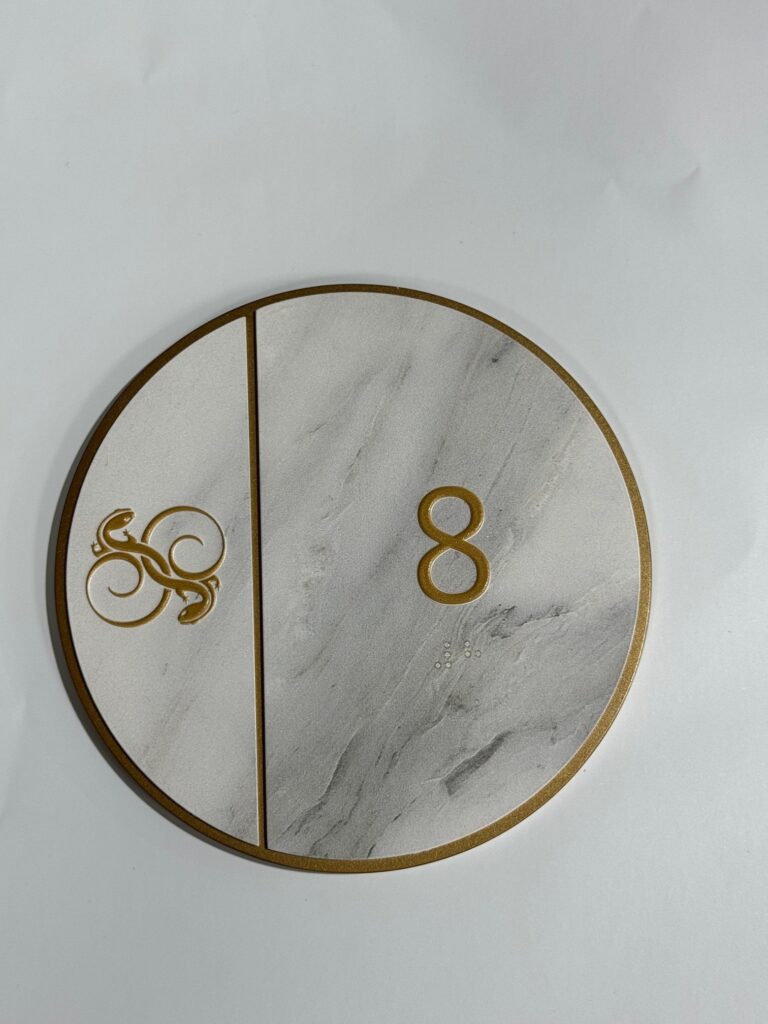
Creating ADA-compliant signage is always a task that demands precision, adherence to guidelines, and quality materials. When a job requires ADA compliance, combined with a luxurious architectural feel and a high-end rating, the complexity rises exponentially. Several challenges arose for this project, which demanded ADA-compliant signage to align with a 5-star establishment’s aesthetic. The final product required value-engineered metal, a marblesque design, CNC fabrication, the Mutoh Printing System, and Mathews Paint Systems. Meeting these high standards while ensuring full ADA compliance was a complex endeavor that required meticulous planning and a cohesive approach from the entire team.
Understanding the Scope of the Project
This particular project revolved around a luxury project that required functional, ADA-compliant signage that was reflective of the architectural sophistication and prestige associated with its 5-star rating. The challenge was to blend compliance with a highly aesthetic design that would align with the space’s upscale look. Each piece of signage needed to serve its functional purpose while maintaining an elegant and cohesive design language, ensuring that the signage did not compromise on either front.
Moreover, the signage had to be value-engineered. Value engineering involves reducing costs without compromising on quality or functionality. This aspect added another layer of complexity, as high-end materials like metals needed to be used strategically to maintain the project’s luxurious feel while maintaining the budget.
High-end, ADA-compliant architectural signs can make a noticeable difference in any exclusive commercial or residential property.

ADA Compliance Challenges
ADA signage compliance mandates specific guidelines for signage, ensuring that people with disabilities, particularly the visually impaired, can navigate spaces with ease. There are strict regulations on font size, contrast, tactile lettering, and the inclusion of Braille.
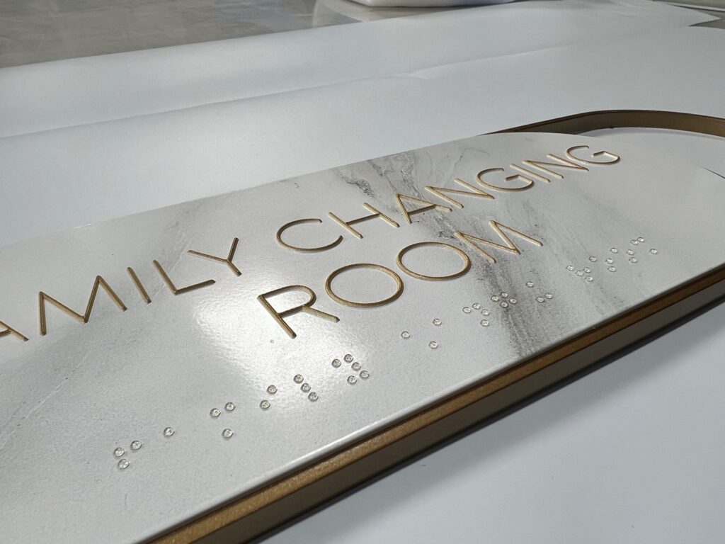
1. Font and Layout: One of the challenges was integrating tactile lettering and Braille into the marblesque design. ADA guidelines stipulate that letters must be raised by at least 1/32 of an inch, with specific spacing requirements to ensure readability. In this case, the artistic and architectural requirements of the signage demanded a fine balance between compliance and design. This meant that the tactile elements couldn’t overpower the overall aesthetic but still had to be prominent and easily readable for visually impaired users.
2. Color Contrast: Another ADA requirement that posed a challenge was color contrast. Signage must have a contrast ratio of at least 70% between the background and the text or graphics to ensure readability for people with low vision. The marblesque design presented a hurdle, as it was essential to maintain the luxurious marble-like texture and appearance while ensuring that the contrast between the text and background met ADA standards. The marble texture’s varying shades and patterns required a meticulous approach to selecting text colors that would complement the design without sacrificing readability.
3. Material Considerations: The use of value-engineered metal added to the complexity. Metal surfaces often pose challenges when it comes to achieving the proper contrast for ADA compliance. Additionally, the metal needed to be treated and fabricated in a way that allowed for both durability and aesthetic appeal while still ensuring that the tactile elements (such as raised text and Braille) were properly integrated into the design. The signage couldn’t simply be a flat piece of metal—it had to be sculpted, textured, and printed on, all while maintaining a polished, luxurious finish that would live up to the 5-star rating.
Metal Fabrication and CNC Challenges
The choice of metal for this project was driven by the need for durability and sophistication, but it also presented several fabrication challenges, particularly since CNC (Computer Numerical Control) fabrication was required. CNC fabrication allows for precise cuts and designs, ensuring that even the smallest details in the signage can be realized. However, incorporating tactile lettering, intricate designs, and the marblesque architectural feel into metal through CNC required careful planning.
1. Precision Cuts: One of the significant challenges with CNC fabrication was achieving the level of precision required for ADA tactile lettering. The raised characters and Braille dots had to be fabricated with a high degree of accuracy to ensure compliance with ADA standards. CNC machines are precise, but working with metal, especially value-engineered metal, requires skill to avoid warping or distortion. The team had to calibrate the CNC machines meticulously to ensure that every cut and engraving was perfect.
2. Material Limitations: Working with metal also meant dealing with material limitations, particularly when it came to thickness and weight. The signage had to be sturdy enough to withstand regular use and environmental factors, but it couldn’t be so heavy that it became impractical to install. Value-engineering the metal meant finding a balance between thickness for durability and cost-effectiveness. The CNC process, while precise, also had to be adjusted based on the material properties of the metal chosen, ensuring that the final product met both functional and aesthetic goals.
Printing and Finishing Challenges with the Mutoh Printing System and Mathews Paint Systems
Once the metal had been fabricated, the next step was to print the necessary graphics and apply the required finishes. For this project, the Mutoh Printing System and Mathews Paint Systems were utilized to achieve the desired marblesque appearance and ensure that the signage met ADA standards for color contrast and durability.
1. Print Quality and Texture: The Mutoh Printing System is known for its high-resolution output and ability to print on a variety of surfaces, including metal. However, printing a marble design on metal presents unique challenges. The intricate textures and color variations that are characteristic of marble had to be replicated with precision, all while ensuring that the surface remained smooth enough to comply with ADA tactile guidelines. The print quality needed to be sharp and accurate, and the ink had to bond effectively to the metal surface to ensure longevity.
2. Durability Concerns: Once printed, the signage had to be finished with a coating that would protect it from wear and tear, as well as environmental factors such as UV exposure, humidity, and physical contact. Mathews Paint Systems was the ideal choice for this, as it provides a durable, protective finish that is both aesthetically pleasing and functional. However, applying the paint system over the printed surface required careful handling to ensure that the colors remained vibrant and that the tactile elements of the signage were not compromised.

Braille signage is required by law in the United States under the Americans with Disabilities Act. This image shows how Stanco Signage created a beautiful ADA-compliant sign using high-end architectural materials and a stylish design.
3. Color Matching: Another challenge during the printing and finishing process was color matching. The marblesque design featured subtle variations in color that needed to be replicated accurately while also ensuring that the contrast between text and background met ADA requirements. The team had to carefully select inks and paints that would not only achieve the desired visual effect but also maintain the proper contrast ratio throughout the signage. Mathews Paint Systems provided the necessary range of colors and finishes, but achieving the perfect match required testing and adjustments to ensure compliance without sacrificing the design aesthetic.
Installation and Final Adjustments
Once the signage was fabricated, printed, and finished, the final challenge was installation. As part of a 5-star project, the signage not only had to meet ADA compliance but also had to be installed in a way that aligned with the overall architectural design of the space. The signs needed to be positioned in places that were easily accessible for all users, including those with disabilities, while also blending seamlessly into the environment.
1. Precise Placement: ADA-compliant signage has strict requirements regarding the height and placement of signs to ensure that they are easily accessible to people with disabilities. For this project, every sign had to be positioned precisely, both to meet ADA guidelines and to ensure that they contributed to the overall aesthetic of the space. This required close collaboration between the design, fabrication, and installation teams to ensure that the signage was both functional and beautiful.
2. Finishing Touches: The installation process also included final checks to ensure that the tactile elements were properly aligned, the color contrast met ADA standards, and the signage was free from any defects or inconsistencies. Any final adjustments needed to be made quickly and efficiently to meet the project’s tight deadlines and maintain the high standards expected for a 5-star space.
Creating ADA-compliant signage for a high-end, 5-star project is no small feat. The need to balance compliance with aesthetics, mainly when working with value-engineered metal, a marblesque design, and advanced fabrication and printing systems, added multiple layers of complexity to this project. The use of CNC fabrication, the Mutoh Printing System, and Mathews Paint Systems enabled the team to create signage that was not only functional and compliant but also visually stunning. Despite the challenges, the final product successfully met the client’s expectations and maintained high standards.


